
Data visualisation in SAS transforms raw numbers into compelling visual stories through powerful tools, including SAS Visual Analytics, PROC SGPLOT, and ODS Graphics.
Whether you’re creating interactive dashboards or publication-ready charts, SAS offers comprehensive visualisation capabilities that turn complex datasets into actionable business insights, making it an essential skill for today’s data-driven professionals.
What Exactly Does Visualisation in SAS Mean?
Data visualisation in SAS is the art of converting statistical analysis into visual formats using specialised procedures and platforms within the SAS environment.
It bridges the gap between complex analytical outputs and clear, actionable business intelligence that stakeholders can instantly understand and act upon.
Think of SAS visualisation as your data’s translator. While your datasets speak in numbers and variables, visualisation tools like SAS Visual Analytics and PROC SGPLOT translate this language into charts, graphs, and interactive dashboards that tell compelling stories.
The beauty of SAS data visualisation lies in its dual nature: it serves both the technical analyst who needs precise statistical representations and the executive who requires quick, visual insights for decision-making.
This versatility makes SAS a cornerstone in SAS business intelligence implementations across industries.
Which SAS Tools Create Visualisations, and When Should I Use Each One?
SAS offers four primary visualisation approaches: SAS/GRAPH for traditional graphics, ODS Graphics for statistical outputs, PROC SGPLOT for modern charts, and SAS Visual Analytics for interactive dashboards. Your choice depends on output requirements, interactivity needs, and target audience.
Here’s your decision matrix:
PROC SGPLOT & SGPANEL
- Best for: Statistical charts integrated with analytical workflows
- Output: Static, publication-quality graphics
- Learning curve: Moderate (requires SAS programming)
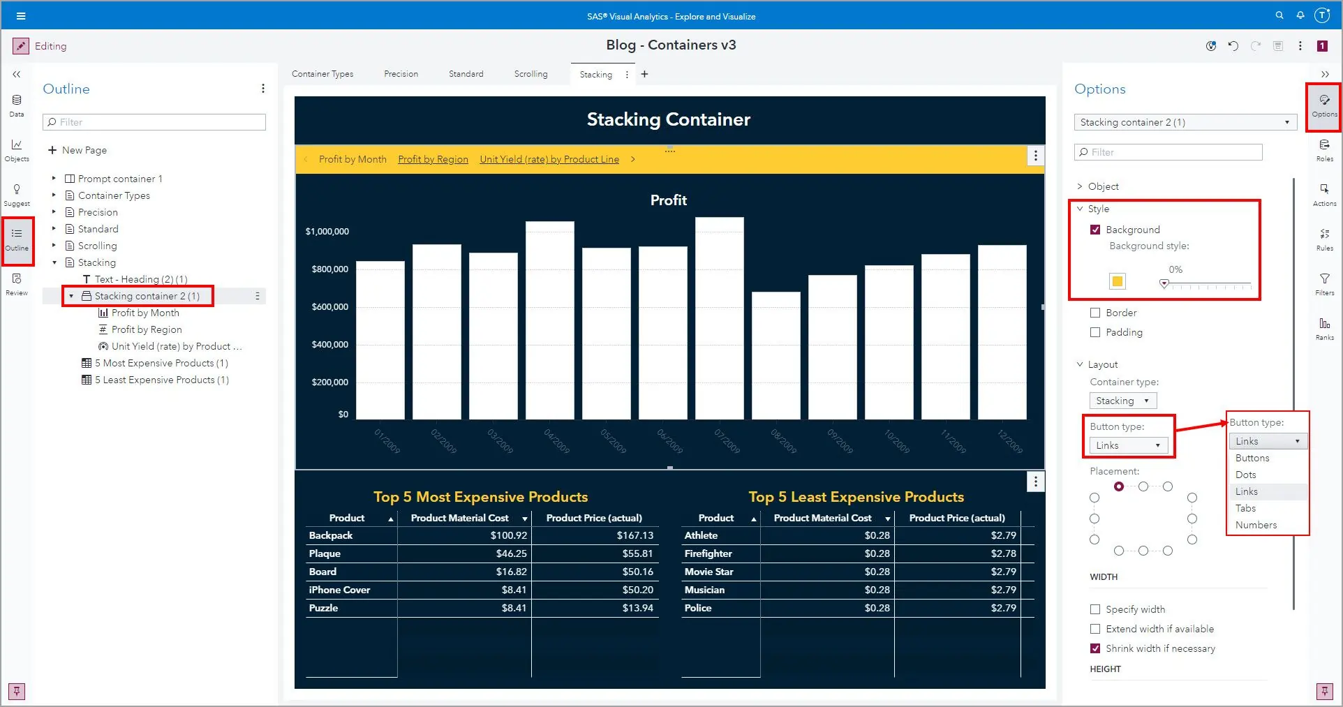
SAS Visual Analytics
- Best for: Interactive dashboards and executive reporting
- Output: Web-based, interactive visualisations
- Learning curve: Low (drag-and-drop interface)
ODS Graphics
- Best for: Automatic charts from statistical procedures
- Output: Embedded graphics with analytical results
- Learning curve: Low (automatic generation)
SAS/GRAPH (Legacy)
- Best for: Highly customised traditional charts
- Output: Static graphics with extensive customisation
- Learning curve: High (complex syntax)
The modern approach? Start with Visual Analytics for quick wins, then leverage PROC SGPLOT when you need programmatic control. This combination covers 90% of real-world visualisation needs.
How Can I Quickly Make a Chart in SAS, Both Code-Based and Drag-and-Drop?
Creating visualisations in SAS follows two paths: code-driven, using PROC SGPLOT for precise control, or drag-and-drop, using Visual Analytics for rapid prototyping.
Both approaches deliver professional results but serve different workflow preferences and technical requirements.
Code-Based Approach (PROC SGPLOT)
proc sgplot data=sashelp.cars;
  histogram mpg_highway / fillattrs=(color=blue transparency=0.5);
  density mpg_highway / lineattrs=(color=red thickness=2);
  title "Highway MPG Distribution";
run;
This three-line snippet creates a histogram with an overlay density curve perfect for distribution analysis. The beauty of PROC SGPLOT lies in its intuitive syntax that mirrors natural language.
Visual Analytics Approach
- Connect your data source
- Drag variables to the visualisation areas
- Select the chart type from the auto-recommendations
- Customise colours, labels, and formatting
- Export or embed in dashboards
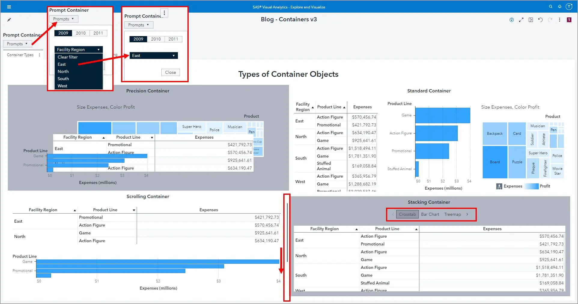
The autocharting feature in SAS Visual Analytics intelligently suggests optimal chart types based on your data characteristics, eliminating the guesswork from visualisation selection.
Which Chart Type Fits My Data Visual Story?
Chart selection depends on your analytical goal: comparisons require bar charts, trends necessitate line graphs, distributions use histograms, and relationships necessitate scatter plots. The key is matching visualisation type to the story your data needs to tell.
| Data Goal | SAS Visualization | When to Use |
|---|---|---|
| Compare Categories | Bar Chart (SGPLOT) | Sales by region, product performance |
| Show Trends | Line Graph (SGPLOT) | Time series, growth patterns |
| Display Distribution | Histogram/Box Plot | Quality control, population analysis |
| Reveal Relationships | Scatter Plot | Correlation analysis, regression |
| Part-to-Whole | Pie Chart/Treemap (VA) | Market share, budget allocation |
| Geographic Patterns | Maps (Visual Analytics) | Regional performance, location analysis |
Pro tip: SAS Viya’s auto-explanation feature goes beyond chart creation—it generates natural language insights that explain what your visualisations reveal, turning you into a data storytelling expert.
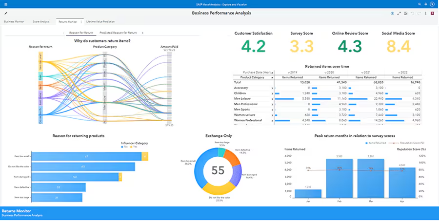
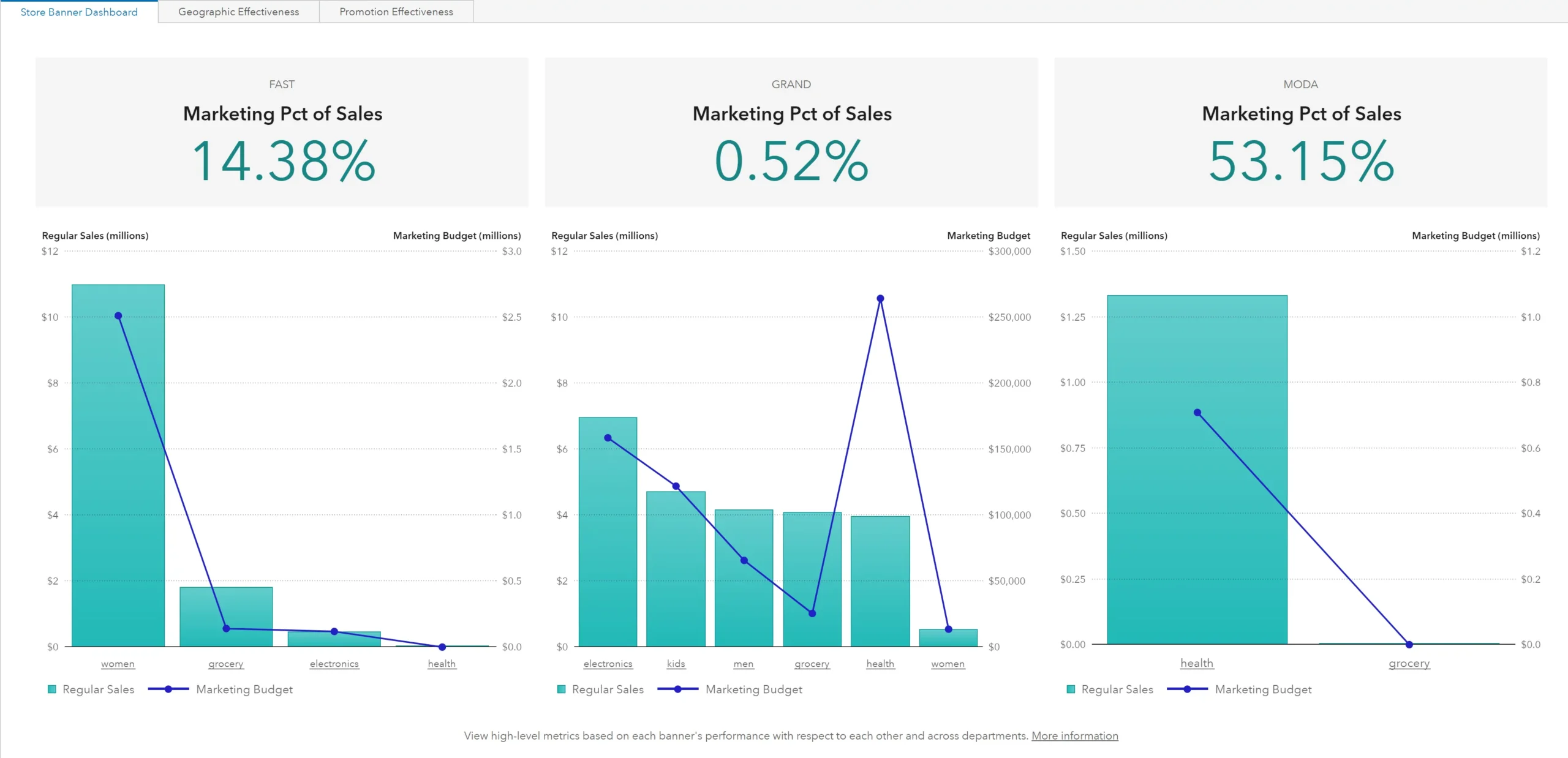
What Real-World Scenarios Show SAS Visualisation in Action?
SAS visualisation excels in three key business scenarios: retail analytics for sales optimisation, marketing analytics for customer segmentation, and operational analytics for performance monitoring. Each scenario leverages different SAS tools to deliver specific business outcomes.
Retail Sales Breakdown
A major retailer uses SAS Visual Analytics treemaps to visualise product category performance. Interactive drill-downs reveal that while electronics drive revenue volume, accessories deliver higher profit margins, insight that reshapes inventory strategy.
Marketing Cohort Analysis
Marketing teams utilise PROC SGPLOT heatmaps to monitor customer behaviour across acquisition cohorts. Colour-coded cells instantly reveal which campaigns generate long-term value versus quick conversions, optimising marketing spend allocation.
Operations Dashboard
Manufacturing operations utilise SAS Viya dashboards that combine real-time sensor data with historical performance. Sankey diagrams track material flow while control charts monitor quality metrics, enabling predictive maintenance before costly breakdowns occur.
These scenarios demonstrate how SAS software data analysis transforms from a technical exercise to a strategic advantage through effective visualization.
How Does SaaS Intelligence Emerge from Data Visualisation?
SaaS intelligence comes alive when raw data is transformed into visuals that highlight patterns, predict outcomes, and guide smarter decisions.
Visualisation isn’t just about creating pretty charts; it’s the front door to strategic intelligence that drives product adoption and customer retention.
Think of data visualization as the lens, and SaaS intelligence as the view. Dashboards powered by SAS don’t just show you what happened; they explain why it happened and, increasingly, what’s likely to happen next.
Here’s how visualization fuels SaaS intelligence:
-
Predictive clarity – detect churn risks early with cohort heatmaps.
-
Operational foresight – track real-time performance and spot anomalies before they snowball.
-
Strategic storytelling – translate billions of rows into clear insights for execs.
For SaaS providers, this transformation is the real competitive advantage. Data visualisation isn’t just about reporting, it’s about empowering every decision with intelligence at scale.
When paired with AI automation in SaaS, these insights become even more actionable, driving smarter workflows across the platform.
How Have Features Evolved in SAS Viya and Visual Analytics Over Time?
SAS Viya represents a cloud-native evolution featuring in-memory processing, AI-augmented analytics, and open-source integration.
Visual Analytics now includes natural language generation, automated insights, and advanced geographic capabilities that weren’t available in legacy SAS versions.
Recent SAS Viya enhancements include:
AI-Powered Features:
- Auto-explanation generates narrative insights
- Brilliant data discovery suggests relevant visualisations
- Machine learning integration for predictive visuals
Performance Improvements:
- CAS (Cloud Analytics Services) enables real-time visualisation of massive datasets
- In-memory processing eliminates traditional data size limitations
- Scalable architecture supports thousands of concurrent users
Modern Integration:
- REST APIs allow embedding in custom applications
- Open-source connectivity (Python, R) expands analytical capabilities
- Mobile-responsive dashboards work seamlessly across devices
However, limitations persist: Visual Analytics doesn’t support accurate 3D visualisations, and complex custom graphics still require PROC SGPLOT coding. The workaround? Combine both tools strategically based on specific requirements.
What About Accessibility, Performance, and Export Practices?
Professional SAS visualisations require attention to accessibility standards, performance optimisation, and export formatting to ensure optimal results.
These considerations transform basic charts into production-ready business assets that effectively serve the diverse needs of various stakeholders.
Accessibility Checklist:
- Colour palettes: Use colour-blind-friendly schemes
- Contrast ratios: Ensure 4.5:1 minimum contrast
- Alternative text: Include descriptive chart titles
- Font sizing: Maintain readable text across devices
Performance Optimisation:
- Data reduction: Aggregate before visualisation when possible
- Refresh strategies: Balance real-time needs with system resources
- Caching: Leverage SAS Viya caching for repeated queries
Export Best Practices:
ODS Graphics delivers publication-quality outputs:
- PNG: Web dashboards and presentations
- PDF: Reports and documentation
- SVG: Scalable graphics for presentations
- Excel: Data tables with embedded charts
The key insight? Think beyond chart creation and consider the complete lifecycle, from data to decision-maker consumption.
Where Do I Go Next to Master Data Visualisation in SAS?
To advance your SAS visualisation skills, it is essential to engage in structured learning through official documentation, community resources, and hands-on practice.
Focus on combining technical proficiency with design principles to create visualisations that drive business impact.
Essential Learning Path:
Foundation Resources:
- SAS Visual Analytics User Guide – Comprehensive reference
- SAS Communities forums for peer learning and troubleshooting
- SGPLOT documentation for programmatic control
Advanced Techniques:
- Data visualisation techniques whitepaper by Justin Choy, Varsha Chawla, and Lisa Whitman
- SAS Global Forum presentations on emerging visualisation trends
- Integration tutorials for custom D3.js implementations
Practical Application: Consider how these SAS data and AI solutions fit within broader AI tools for SaaS providers’ ecosystems, especially when evaluating analytics platforms for your organisation.
Understanding how to classify AI SaaS products helps position SAS visualisation capabilities within your technology stack, ensuring optimal tool selection for specific business requirements.
Advanced Considerations for Modern Analytics
Long-tail optimisation opportunities:
- Large dataset visualisation: Leverage SAS Viya CAS engine for real-time processing of billion-row datasets
- Embedded analytics: Integrate SAS visualisations directly into web applications via REST APIs
- Automated reporting: Schedule dashboard refreshes for stakeholder consumption
- Cross-platform compatibility: Ensure visualisations render consistently across mobile and desktop environments
The evolution of semantic data exploration in SAS enables natural language queries that automatically generate appropriate visualisations, transforming the way business users interact with complex datasets.
For teams considering branded, client-facing solutions, exploring white-label AI SaaS can offer faster adoption without incurring heavy R&D costs.
Final Insights
Data visualisation in SAS isn’t just about pretty charts; it’s the bridge between raw analytics and clear business intelligence. Whether you’re coding with PROC SGPLOT or building dashboards in Visual Analytics, the real win comes from aligning the right tool with the right business need.
SAS Viya takes this further, blending traditional graphics with AI-driven insights to deliver faster, smarter decisions. Start with the tools that fit your workflow today, expand as your requirements grow, and you’ll turn complexity into clarity, fueling better communication, quicker insights, and stronger outcomes.
